Interview with Esque
I met Esque at a show and was immediately drawn to his minimal, modern, yet medieval style. I’m a sucker for a quality ink-er.
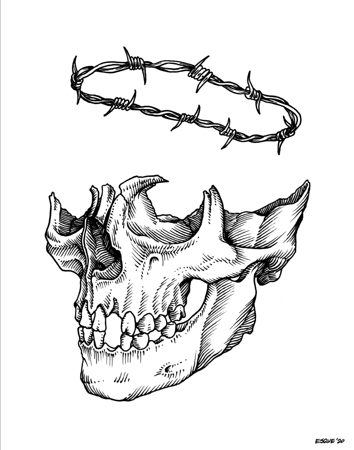
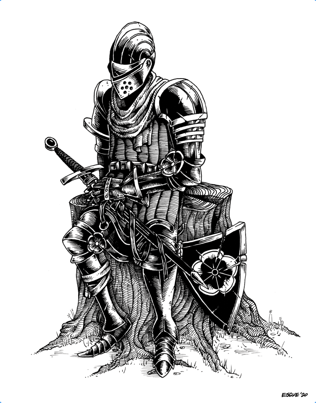
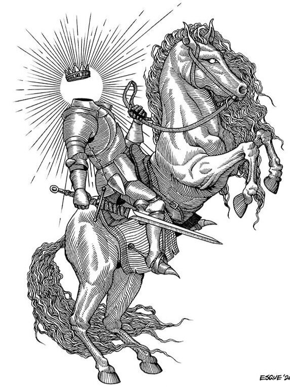
His use of negative space leaves you with a seemingly simple image of a skull, a sword, or even a full-on blood bath. Since meeting him, I’ve learned more about him, his style, and how he operates. Are there any secrets? No. Look at his work, you can see every line he strokes with full intention. Maybe illustrators like this are the strongest because you know they commit to their craft in the same what that they commit to each stroke. Mess up one hatch and it’ll be obvious.
I do look at his work and wonder if others feel a sense of clarity when observing. There’s nothing to hide and he gives a crisp aurora, like a halo of contrast around his work that is distinguished, and refreshing.


